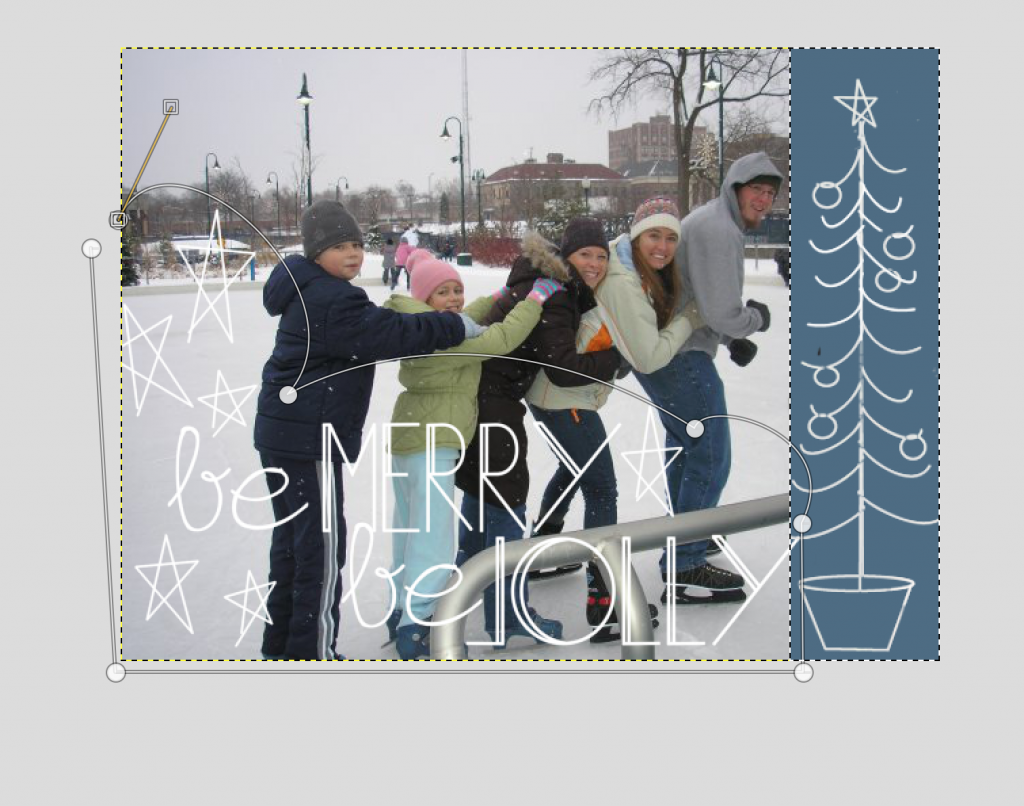
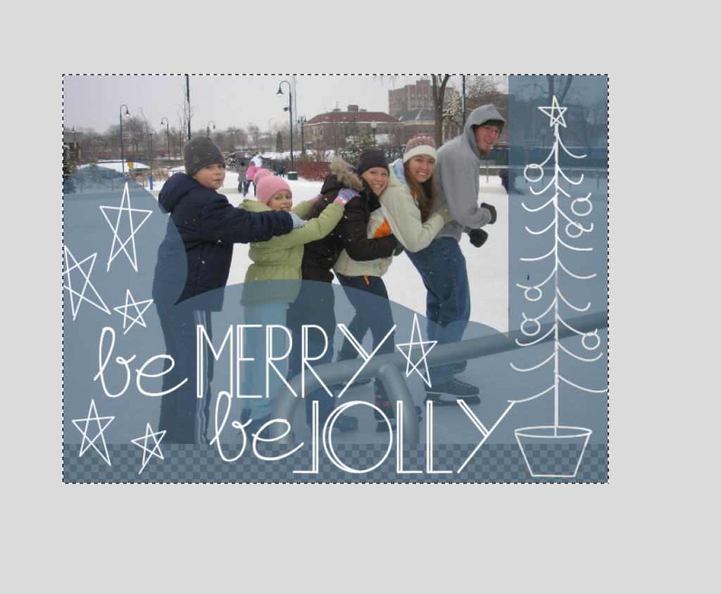
Today I’m going to give you a beginner’s lesson in design. Let me put it this way…If I can do it, you can definitely do it. So I’ll be showing you step by step how to make this:
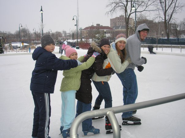
From this:
Pretty enough to be a card, right? Well first, let me tell you that you can do this. There is nothing special about the quality of the photo or the skills you need to put it together. My mom took this photo of my family skating a year or two ago. It was snapped on a plain jane point and click camera. {Mom is not a photographer.} All you need is a little imagination, yesterday’s cute elements and this tutorial.
This is a long post…so you’ll have to click through to see the full tutorial.
Step #1 is to download GIMP. It’s freeware and it’s awesome. Totally safe. I use it to do all my editing and graphic design.
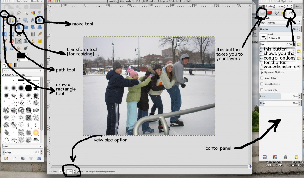
Now that you have GIMP. Open the program. Then go to “file” and “open.” Choose the photo you want to work with.
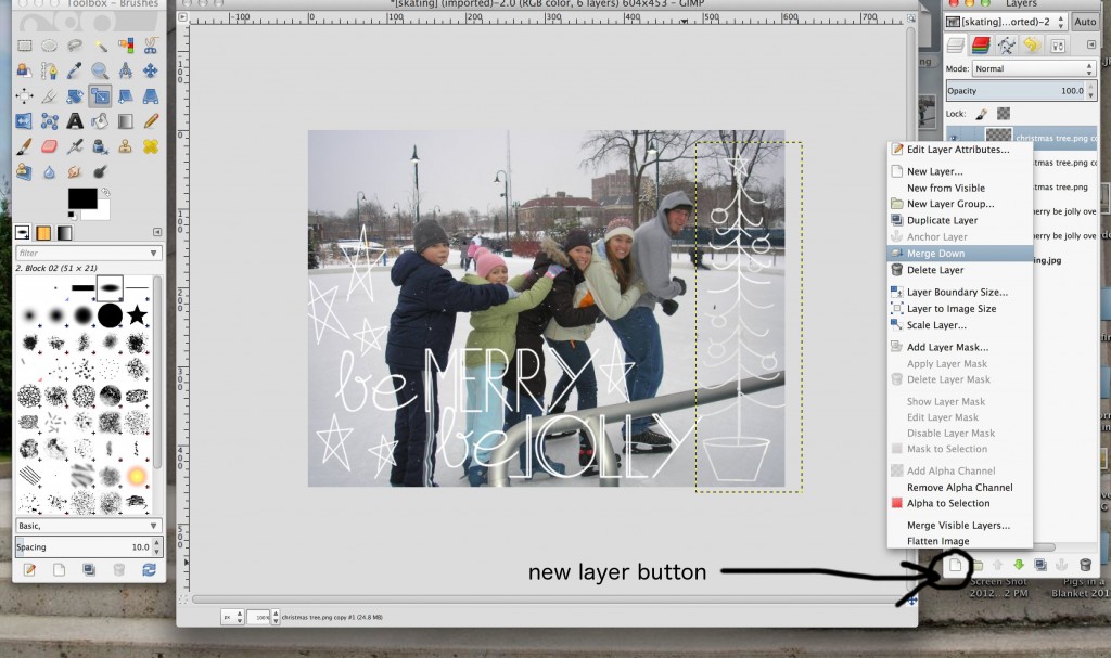
On the screen shot above I’ve pointed out the tools and buttons we’ll be using.
Now go to “file” and click “open as layers.” Select the photo element from yesterday’s post you want to add.
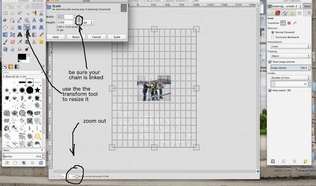
When it opens, it may be a quite a bit too big for your photo. Don’t freak out. You just need to resize it. Click the transform/scale/resize tool from the toolbox. {I pointed it out in the first photo.} Next, zoom your photo out so you can see the whole element. Mine needed to be zoomed out to about 25%.
Resizing is easy once you’ve zoomed out. In the dialogue box that pops up with the tool, be sure the chain is linked. That locks the aspect ratio. Then just drag the corners of the element to the size you want it. To move the element as you scale, click and drag from the very center {the cross inside a circle.} Once you have it the size you like and decent placement…click “scale.”
Repeat this process to add all the elements you like.
Once your elements are all uploaded you can fine tune the positioning. In your control panel, click the layers button {see first photo}.
Let’s take a brief moment to chat about layers. When you are working in a program like GIMP you’ll use layers. A layer is literally a “layer” of your image. This let’s you move and adjust each individual element of your design without messing up the parts that you like.
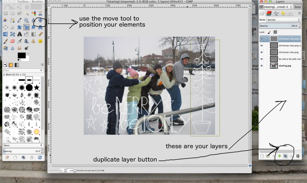
When you click into the layers window, you’ll have these layers: your image…and a layer for each element you opened. The layer on top is literally laying on top of the others. The layer at the bottom of the list is the background. You can reorder them by dragging one above another.
To reposition one of the elements, first highlight the layer you want to move. Then get the “move” tool from the toolbox. Then click the element and drag it to where you want it to be. {Tip: Put your mouse right on a part of the element…like on the white of the text…or else you’ll end up moving the background!}
The elements looked a little too light against the light background on my photo. So I made them a bit more bold. It’s easy. Just click the element you want to make a bit bolder, it will become highlighted. Then duplicate the layer by hitting the “duplicate layer” button. {See photo above.}
It looks really nice. You can stop here and you’ll have a lovely image. If you like the way this looks…scroll down and learn how to export it. If you want to add a little more, keep reading.
If you duplicated layers, now’s the time to merge them together so it’s easier to work with. Basically, we will be super-gluing these layers together. Right click on the layer at the top of the list. Then click “Merge Down.”
Merge all the extra layers together…EXCEPT the background image. Leave that one alone.
Next, we’ll make a new layer. So click on that button {see the photo.}
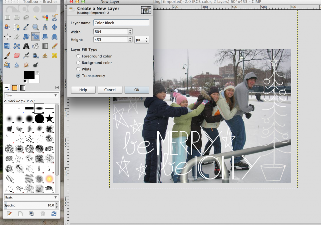
Once you click the “New Layer” button you’ll see this box pop up. You won’t need to change the size. Just make sure you click “transparency.” Then hit “ok.”
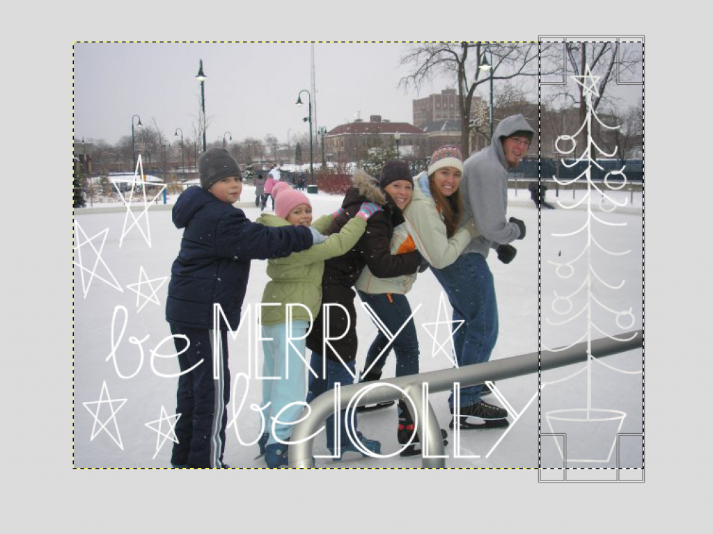
I wanted to highlight the elements a bit. I started by drawing a rectangle around the Tree and filling it in. Grab the rectangle button {see the first photo} and draw a rectangle around your tree. Adjust the size by pulling the sides. When it’s the size you like, hit “enter.”
Next, fill in your rectangle. Make sure your transparent layer is highlighted in your control panel. Then grab the Paint Bucket tool from your tool box. {It’s the one that looks like a paint bucket.}
Pick the color you’d like your rectangle to be by clicking the color block below the tools. {The one on top.} A color selection window will come up. Click the color you want then hit OK.
Go to your image and click inside the rectangle you drew. It should fill in with your color.
Did your tree disappear? That’s okay. Look back at your layers control panel. Click the layer you created and drag it down below your elements layer. See it?
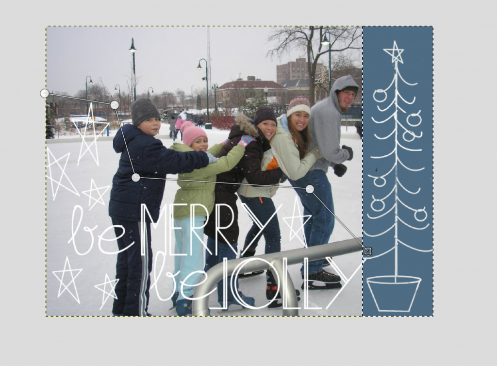
Now let’s draw the wavy line around the other element. We’ll be working on the same layer as rectangle. So make sure that layer is highlighted. Click the “Path Tool.” {I showed it in the first image.} Click points around the element to make a path that roughly surrounds it.
Draw points so your path is pretty much a complete shape. Now, turn your attention to making a lovely path. A jagged line isn’t very pretty, so let’s add some curves. To curve your line, pull up on the path between points. If you click on a point you’ll get a control that will let you stretch your curve. Once the line looks how you like hit “enter.”
Now, grab the paint bucket again and fill this new shape.
**If you make a mistake in your path, just highlight a point and backspace. That will delete the point**
Looking good. But I felt like the color was impeding on our bodies a bit too much. Easy fix.
First I changed the opacity {the see-through-ness} of the color block. To do this, highlight that layer and drag the opacity slider down. {The slider is in the control panel above the layers list.} Better, but I still wanted to see more of us.
To fix this I moved the background image up a little and created another rectangle.
Click on the background {bottom-most} layer. Then get your “move” tool out of the tool box. Then just click on your image and drag it up a bit. Now the image will look like the photo above.
See that checkerboard stuff? That is a transparent part of the image. We need to cover it. Now, show off your skills.
Create a new layer. Draw a rectangle big enough to cover the transparent part. Fill it with the paint bucket. Move the layer so it is just above the background.
Okay. We’re done!
It’s so pretty! Good job. Here are a few more tips for using GIMP to make a card.
1. If you have a certain size in mind for your card, start your project by going to “File” and “New.” Instead of opening an image. Here you can select a specific size. Then open your photo as a “layer.” Resize it to fit.
2. Add a personal note by grabbing the text tool. It’s the big “A.” Drag a text box then type.
3. Use a service like Vista Print or Staples to print your cards. They let you upload a custom image.
Hope this all made sense. I know you can do it!
Amy


