Did you know that I was formerly banned from hanging things on the walls of my house? Yes, me. The girl who can rip out a wall, tear up carpet, wire a light and texture dry wall. I can make over a room like the best on HGTV, but I was banned from putting nails in the walls. Sad, but true.
It started when I lived in Florida. I know some of you readers are friends from those days, so this story will probably ring a bell with you. Back in 2009 I was a newly wed, living in a new state and a cute rental house with my new husband. This was my first place outside of a college rental house I shared with my girlfriends down the street from our University’s village. Pretty big deal.
Like all newly wed girls I was pretty stoked over our wedding photos. I loved them and I wanted everyone who came into our house to know that we had had a wedding…and it was awesome. I wanted…a gallery wall.
I wish I had a photo of this undertaking. It was really something. Like most of my best work, I hit this project hard one evening when Derek wasn’t home. Unlike most of my best work…this was a pretty big fail.
I went in armed with a huge blank wall and a lot of photos and cute frames, but things really took a nasty turn. Here’s what went wrong:
1. My photos were TOO SMALL. At the time I had no concept of what size wall art should be. I printed a load of 4×6 and 5×7 photos {and just a couple 8×10’s} and expected them to look good strung up on my giant wall. What I ended up with was a messy looking display of things that you had to be right next to to view.
2. It was more vain than artistic. This gallery wall was dubbed by our friends {and ourselves} the “Wedding Wall.” Seriously, just photos of our wedding. Lots of them. It’s nice to have photos of yourself around, but a gallery wall is a home focal point. After a while I felt kind of weird about having so many pictures of us on display. I mean, we see ourselves all the time…A gallery wall should speak to who you are in a creative way, without becoming a shrine to you, you, you. **I’m not saying you shouldn’t include yourself on your wall. Just don’t overkill it like I did.**
3. This is the big one…I didn’t plan. I thought I could go in with a rough idea and come out with something Martha herself would envy. Wrong. The reality was I ended up hanging a frame, then hating it and moving it…and making another and another hole in the wall.
It was this second error that caused me to lose my hanging privileges. When it was time to move it looked like Al Capone himself had taken a tommy gun to our wall. There were so many, many holes. Derek and I had a pretty good laugh about that. Then he said I should probably run everything I wanted on the walls by him before any nails get hammered.
This ban was never officially lifted, but this summer Derek isn’t around and I really, really wanted another crack at the old gallery wall game. This time I was determined to do it right. It was like a Tosh.0 web-redemption. I got a second shot to do something trivial and meaningless right. And I’m happy to report that I succeeded. Here’s the secret:
PLANNING.
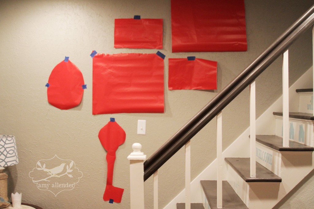
Go figure. One of my favorite high school teachers used to tell us that “Proper preparation prevents a poor performance.” {Bonus points to any Jimtown Jimmie that can name the author of that quote.} And boy was he right. I spent an evening looking at all my gallery options, then whittling it down to only the best. Once decided I traced the shape of everything I was going to hang on some cheap-o wrapping paper and played with my layout like so:
Once I was happy I carefully hammered a nail through the paper, took the paper off the wall and hung my frames.
I didn’t mis-nail once! I guess you could say I really “nailed” this one. Don’t even try to tell me that wasn’t a clever pun.

So here are my tips for being successful with your focal gallery wall.
1. Decide what you want to hang.
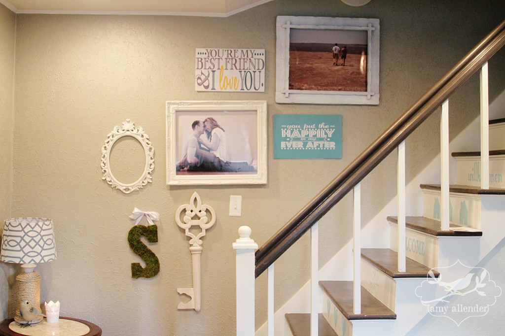
2. Keep a common theme. Go figure, my theme here is white…my favorite decorating color.
3. Be simple. Bigger and fewer is a good place to start. Lots of small frames can look crowded and cheap.
4. Be thrifty {that’s really a life tip.} I had my big prints made at Staples. They are printed on photo paper, then glued to foam core. Much cheaper than canvas prints and easy to switch out.
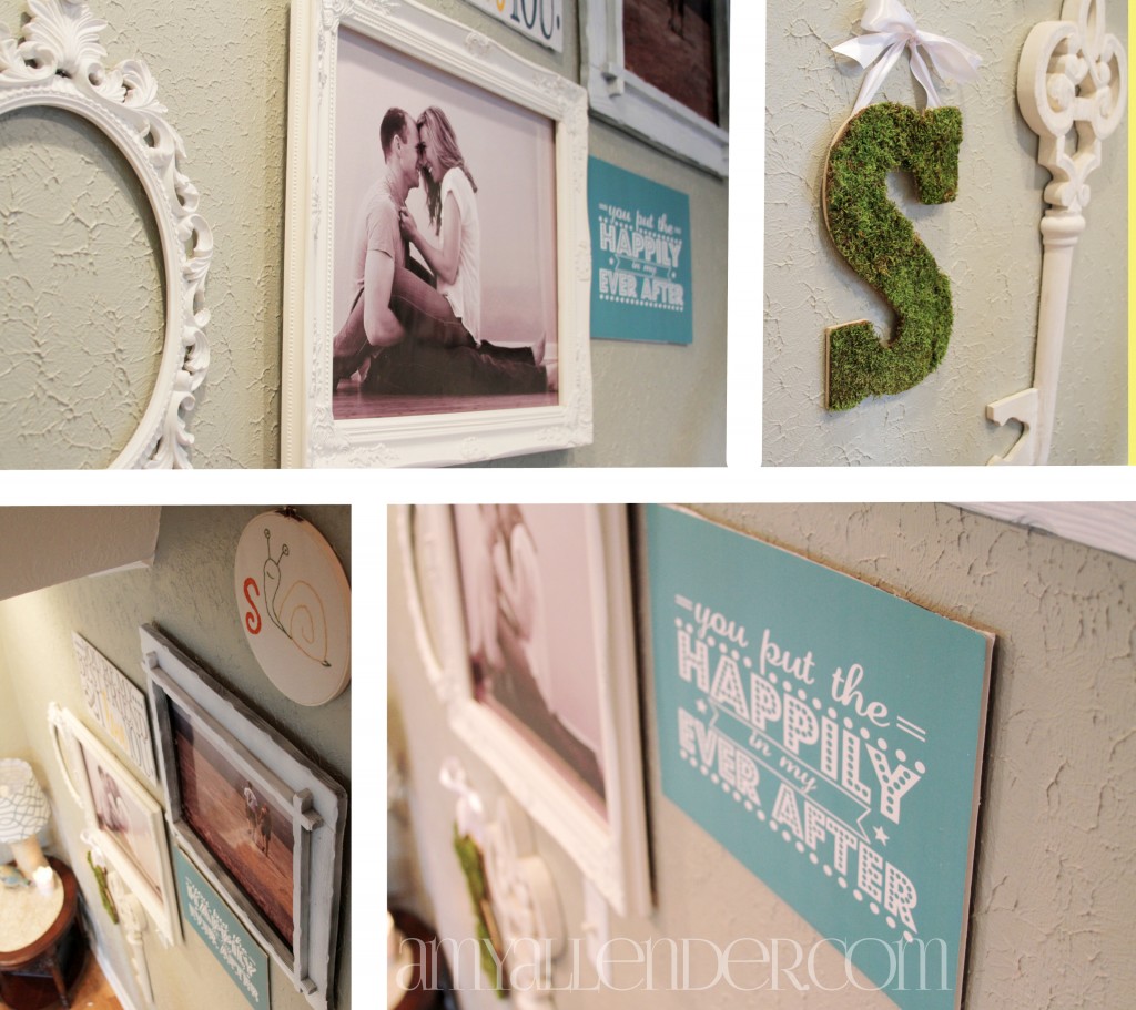
5. Put up things you love. While Derek is gone I love seeing a photo of us together on the wall. When he returns I may change it. Who knows. The other large print is of us hiking in Texas. Both remind me of happy times. I like happy. That empty oval will soon house a portrait of my cat. Don’t judge me.
6. Leave room to grow. You never know when you’ll want to add. Plan some space for future finds.
It feels so good to have my hanging privileges back!
Amy


